How Microsoft Made the Web Ugly & What to Do About it

*
This is a sad story with a happy ending about the way Microsoft has made the Web ugly and what to do about it.
You have to act now though or you lose readers and customers.
In a more descriptive way it deals with body text readability in the age of default font smoothing.
Website Typography is Broken
The typography of many sites is literally broken without their respective owners’ knowledge it seems.
You can’t ignore the fact anymore that your body-text is fuzzy and difficult to read. You simply ostracize visitors!
Have you heard the term anti-aliasing? Most people probably haven’t unless they are graphic designers.
Do you know what ClearType is? Both are dealing with font smoothing. What you need that for you might ask? I’m not sure myself.
Ideally font smoothing makes text appear more readable and good looking on screens. In reality it often doesn’t unless you make sure it does.
Web-safe Fonts
It all started with Times New Roman. Early websites used Times as the default font because it was known from newspapers.
Times New Roman didn’t look good nor was it very readable on the Web but at least you could print it out in the early days of the Internet.
Later on more so called Web-safe fonts like Helvetica and Arial appeared and finally a really good crispy font for body text took center-stage: Verdana.
Web-safe meant available, readable and looking the same on all platforms. Then things got worse again.
Starting with Windows XP Microsoft introduced a proprietary technology called ClearType to smooth fonts.
Windows ClearType
Windows not only ships with ClearType pre-installed since XP, it’s also activated by default since Vista.
This whether you like it or not, most people use ClearType on Windows to smooth fonts. I use Windows too but I don’t like smooth aka fuzzy body text fonts.
Body text fonts that have been smoothed strain my eyes and look ugly. That’s why I switch ClearType off on my machine.
In recent years I was able to ignore the fact that my body text looks pretty and readable to me while to most other people it doesn’t.
Web-safe fonts looking blurry
I was testing a site lately on different browsers and platforms and was again alerted to the difference font smoothing or lack of it makes.
Maybe I’m one of the people who can’t distinguish colors as good as the Clear Type technology requires to be of use.
On the other hand even highly accepted fonts such as Helvetica/Arial look blurry and clumsy when font smoothing is on.
Just compare these two, first the crispy version without ClearType, this is what I see and then the default ClearType font smoothing version, this is what most of my readers see:


Is the second one really better readable as Microsoft claims? I doubt it. In case it’s just me, look at the font, it looks blurry and ugly.
Even in case you don’t care you will notice on a sub-conscious level and dislike the overall user experience.
The smoothed Arial barely resembles the elegance of the classic Helvetica font it is based on. When anti-aliased Arial loses its elegance completely.
Microsoft has introduced a special set of proprietary fonts that look OK with ClearType, most notable Calibri, but these fonts are mostly Windows only:

Users on other platforms may see other fonts instead. Apple and Linux systems are reportedly better at font smoothing than Windows.
Yet you also want to make your site look more or less the same on all platforms, don’t you? Remember to check on mobile phones as well!
Font smoothing not activated
It doesn’t even have to be a corporate identity. The sheer readability of body text improves or deteriorates a lot depending on whether you have taken font smoothing into account or not.
Many fonts that are perfect in small sizes without font smoothing are causing problems once font smoothing is switched on.
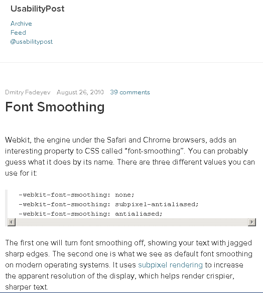
On the other hand your perfectly smooth font can look really broken on systems not using font smoothing. Not every font works both ways with font smoothing turned on and off:

The example above is ironically taken from the Usability Post article on font smoothing. With ClearType off there is no font smoothing left
The font is looking really weird. It’s broken in a way. Notice the bizarre additions to the “e” for example.
Some people turn off ClearType on Windows of their own accord, others simply do not have it activated it as they use Windows XP on netbooks for example.
Anyway, neither keeping on using your standard fonts like Verdana or Helvetica/Arial nor using some new smooth by design fonts like Calibri is the perfect solution.
For each one of them there are real life use cases or rather users who won’t be able to view them properly. You can’t rely on them.
Webfonts for body text
Of course there is third kind of solution I want to suggest today: webfonts. Webfonts are a by now popular way of modern font replacement for high quality typography.
Webfonts are often basically rented fonts you access on a third party server. Google Fonts is by now the most popular free webfont foundry.
You can display body text using Webfonts not just headlines unlike the early font replacement techniques.
There are even a lot of free Webfonts from a few services you can use. Sadly it’s not as easy as you might expect. The choice of the right font and font size is crucial to ensure readability.
- Some fonts will look OK with old school font smoothing but not with ClearType.
- Some font sizes are too small to be still readable using webfonts.
- Many fonts are too fancy to be of use for body text.
So you have to chose the body text font wisely and test it even on Windows on several browsers and with ClearType on and off.
I have tested lots of free webfonts on my own microsite over at onreact.com – One day I chose Muli for both h2 subheadings and body text.
It worked best with simple anti-aliasing and still OK with subpixel rendering. That’s what ClearType does too. At the end of the day it did not look good on all browsers though. So I kept on experimenting.
Browsers Display Fonts Differently
Different browsers on Windows will treat smoothed fonts differently. Firefox simply anti-aliases them (first screen shot)
- Chrome
- Opera
- Internet Explorer
use subpixel rendering (second screen-shot from Chrome):


As you see the readability here is not perfect yet. At least it looks the same with ClearType on and off now.
Please note how the same font size is a lot different on both browsers though.
On FF the readability is better. On Chrome etc. the font looks more like the original design of it but is harder to read.

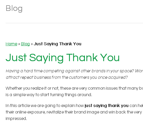
Vinny La Barbera’s blog uses Questrial as a webfont. It looks both good and is readable. It works for headline and body text. Still, on Chrome the display is not perfect here either.
Another similar free webfont that I have seen working pretty well in the wild is Quicksand. All three are not perfect though. In some common sizes and colors the readability suffers.
I consider using some high quality paid Webfonts instead. I have collected lots of them for testing purposes and have still to choose one. I may follow up on this topic in the future.
Webfonts – even free ones – are not only available from Google Webfonts.
You can get them from Adobe as well or Fonts.com where you can get high quality professional fonts for 10$ a month and many other vendors.
A professional font like ITC Avant Garde Gothic in its Web optimized version works well both from a readability perspective and to please the eye.
What about you? Do you care about readable body text readability or do you just focus on getting your visitors?
Do you assume that once they are on your site people will stay there and read your text no matter how it looks?
* Creative Commons image by matt knoth.

THANK YOU for sharing this! I share your views 100% and have been beyond frustrated by this same issue. Having worked as web designer and developer since 1996, I noticed that the web experience has deteriorated so much it’s hardly imaginable. The web has been ruined by mobile devices and cleartype trends.