How to Make Your Website User Friendly Like Fashion Magazines

This is a contribution by Daniel Bishop, freelance writer and editorial consultant. I added some text formatting, images and edited the post a bit for clarity.
Over the past decades, the emergence of websites, online journals and magazines has made printed media occasionally seem like something obsolete and out-of-date. However,
as much as 69 percent of Americans still read actual printed newspapers on a regular basis. In UK, this number climbs up to 74 percent.
Furthermore, paper ads provoke greater emotional reactions in readers than the digital ones and people generally tend to trust printed media more.
Therefore, print is still far from being dead and it has been around for so long that it’s safe to assume that there are some tricks to learn from it.
User Friendly Websites vs Glossy Fashion Magazines
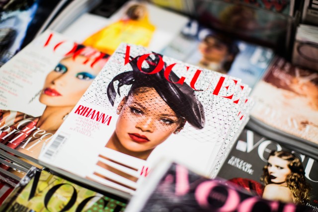
Indeed there is a whole lot digital media could learn about making user friendly websites from the rules and practices applied by their printed counterpart, especially glossy fashion magazines.
This goes for
- writers
- columnists
- editors
- designers
and everyone involved in the creation and development of digital content.
More specifically, we will take a look at how user experience of the websites can be improved by studying what’s done right in good old glossy fashion magazines.
In spite of the fact that these are very different media in terms of
- approach
- form
- revenue models
there’s several important lessons taught by traditional magazines that can improve user experience in the digital realm as well.

Strict Editorial Policy
The first advantage of printed magazines over digital ones is the simple quality of content.
For the former, there’s a limited amount of articles and stories that will make the cut on a certain week or month, while in the digital world such a limit is basically non-existent for most media.
Always think twice before publishing a blog or a guest post. It will bring some traffic to your website, but you should ask yourself if it delivers any value to your site or your readers.
Too much content can make the website look too confusing, cluttered and overwhelming.
This sort of hyper-production may do more harm than good and a few clicks you’re about to get just aren’t worth it. Therefore, avoid excessive and irrelevant content.
Consistency
What’s typical of traditional fashion magazines is that they look coherent and consistent from page one all the way to that shampoo ad on the back cover, as if every article and every image tells a specific aspect of the same story.
This consistency is what makes their readers loyal and committed, and makes the whole brand that’s built around the magazine look solid and reliable.
Uniformity of this sort should be delivered on many levels – from layouts and typefaces to terminology, voice and overall approach.
A printed magazine looks like a coherent, logically ordered entity, which ensures that the readers know what’s coming next and thus feel like home while reading.
Simplicity
Just like you need your content carefully filtered and refined, you need to do the same with your visual identity as well.
When it comes to design, sometimes less is more and this is much more obvious in most of the printed magazines.
Too often websites are clogged with banners, recommendations, call-to-action buttons, native ads and all sorts of distractions. This is likely to chase away a lot of visitors.
Printed magazines are usually designed to look clean and neat, which is something that top graphic design agencies are trying to implement in websites they work on as well.
White Space
An integral part of clean design is the proper use of white space.
Again, websites are too often packed with excessive design elements and ads, which can be quite overwhelming and not pleasant at all for the users.
White space gives them some breathing space, gives their eyes a place to rest and makes the content more legible and easy to scan.
Do you want your visitors to have an enjoyable experience while roaming around your website or reading an article?
Then balancing out the positive and negative space the way it’s done in print can be a great strategy.
Colors
The power and symbolism of colors doesn’t change too quickly, so turning back to fashion magazines to see how they used decades of experience to deal with it is not a bad idea.
Choosing and combining the right colors for the message you want to convey and the impression you’d like to leave can be vital.
Neutral colors usually go well with a simple and elegant design, but depending on your niche and overall style, going for brighter colors can be absolutely fine, especially for fashion web magazines.
Make sure you get familiar with the psychology of colors.
For example, when you want to provoke the feeling of growth and success you could go for green!
In case you need something that reminds people of joy and happiness choose yellow, while adding purple to the mix can suggest luxury or romance.
Hierarchy
Another crucial aspect of user experience is clearly and obviously highlighting the most important pieces of information.
This is something that has been perfected in printed media for centuries now. The content ought to be organized in a logical and predictable manner.
You should try employing visual and typographic hierarchy to direct the reader’s vision around the focal points of the page.
Let people get the gist of an article just by quickly scanning through.
Using
- headings
- subheadings
- different font sizes
properly is crucial in order to achieve this.
The fact that users can quickly find out whether they’re interested in the article and whether they should look into it more thoroughly is something that enhances their experience significantly.
A visual hierarchy can save them a world of time and effort.

Respect the Differences
Obviously, you should always have in mind that the two media we’re dealing with here are very different.
The above mentioned tricks will definitely make your users’ stay at your website much more comfortable. However, not everything that works for printed media works in the digital world and vice versa.
The biggest discrepancy comes from the way each of these make money. To be fair, this is what directs editors’, owners’ and designers’ behavior at the end of the day.
At the end of the day you should try learning from glossy fashion magazines without merely copying everything.
Just be careful when implementing what you learned from them and take into account the specific features and peculiarities of each of the media in question.
Daniel Bishop is a full time editorial consultant for small businesses.
He started off as a freelance writer on a couple of blogs and in a few years began leading his own small team based in Europe. Eventually he became a consultant for all editorial issues.

This is one of the most valuable articles I have read in recent day, I will make sure to bookmark this, these are the valuable tips