Sometimes it’s not about the huge website relaunch.
Amazon and other market leaders only add incremental changes without ever fully redesigning their websites.
Yet such an approach often leads to feature creep! What then?
Clutter due to growing sites
Yes, many sites need huge mega menus to accommodate the added depth or breadth.
The increasingly difficult user experience emerges due to clutter.
It’s often far better to take small steps and simplify.
Thus I decided to show you a few simple ways to optimize your site.
These do not take a lot of time or effort and have a significant impact on your business.
Enlarge your body text and make it more readable

It’s no secret that making your site readable is one of the most important things to make it work.
Yet, most sites are still barely legible and readable. Thus they ostracize readers or even casual visitors.
Readability is about
- font size
- line height
- text formatting
to name just a few formal design aspects of body text readability.
Most sites still use too much small print. Especially footers are prone to be unreadable.
It’s not just about proper body text fonts.
It’s about enough white space for the eyes to rest, including line breaks and letter-spacing.
Enlarging your body text size is the easiest step of course. It takes a minute.
You can do right away. Do it now! Did you? Then read on.
Simplify by removing redundant site elements
A few years ago I have banned Google search on my blog here. No kidding!
Instead of looking up what keywords my users search for I have looked closely at where they come from.
I also checked what they actually do on my site. Most users do not click categories or even use the search input.
New visitors who appear on the site first time sometimes click the recommended articles. That’s all.
I considered moving or even removing some of the legacy blog sidebar elements.
Finally I let go one column – just like many conversion optimization experts recommend.
You can reach relevant categories, comments etc. from each post anyway!
Thus cluttering the sidebar with them makes little sense.
Instead I may be able to make room for even larger and more readable font sizes!
Update existing content and improve its findability
Blogging is nothing new anymore. It has been around for like 25 years. Indeed the Web gets older too.
Thus more and more content is online and a lot of it gets stale without ever getting reviewed or renewed. That’s a shame and a waste of resources.
Even in case the existing valuable content is there and it got updated it’s often difficult to locate it onsite.
People simply can’t find evergreen content when it’s buried in the “archives”.
I considered making some of my classic resources more findable for example. They get linked by colleges a lot but it’s really hard to find them onsite here.
My evergreen resources are worth it. I finally did. You can see them on the right!
I haven’t embraced tagging on this blog here. Yet I did on other blogs and I see the differences too (hint: tags get used a lot to locate older content).
Add a list of calls to action in your footer

The footer of a site is often a neglected space.
Low quality sites tend to stuff it with keywords or barely readable “SEO content”.
Keyword stuffing is nonsense of course. Other sites have no real footer at all. That’s not good either. Why?
Apparently many people who don’t find what they are looking for on your site try to find it in the footer section.
A test has shown an impressive increase in conversions when calls to action have been added in the footer.
Adding a footer CTA is certainly worth a try. Master Your Website has a great example.
Add a brand or website address to outgoing link anchor text
Another test has proven that people really like branded anchor texts or destination addresses there.
That means they prefer a book you can buy at Amazon or bn.com instead of this cool store or to click here as the anchor text of the outgoing links.
It’s not really hard to implement changes here but obviously it helps with usability and click through rates.
Just imagine you earn money with every outgoing click! How lucrative for affiliate sites for example.
In any case simplicity is your friend when designing and optimizing your site.
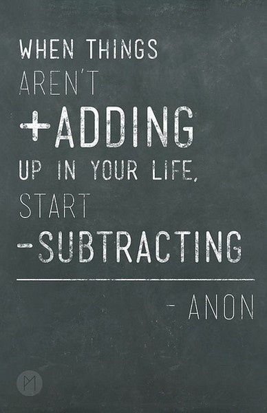
It’s not about adding features and items. It’s about subtracting actually. Show less but make it more visible.
Do not mimic portals from the late nineties. Make the early Google designs with just the search box your role model.


