*
One of the most important things on the Web is readability. Why?
People who can’t even read your body text leave!
Despite that to this day many still neglect it, even
- publishers
- bloggers
- UX designers.
I often ask people to improve their readability on social media.
Otherwise my strained eyes prevent me from reading it.
Yet they often get defensive and even add snarky remarks!
They treat is as “unsolicited advice” and reject it.
That’s a big surprise. After all I try to help them.
When you make your content readable you get more
- views
- reactions
- comments
- shares
- links.
And ultimately also sales when you have on online business.
So how to ensure basic readability of your content?
You can design it with very simple means. Here’s how!
Why even internet professionals fail at readability
Can it be that even Web-savvy people do not get the basics of designing readable content?
Yes. One day I was at a meeting dealing with the relaunch of a client site.
The designer told us — after I inquired how they want to design the content — that content design is up to us.
I was flabbergasted to be honest! Whaaat?
What they told me appalled me even more:
They design the site and put dummy text aka “lorem ipsum” all over it and we “can” style the content ourselves.
The right reply to such a remark and also the perfect readability advice when it comes to dummy text should be:
Lorem ipsum yourself! I’m not a dummy!
Of course skipping content design is the wrong approach.
How can a designer ignore the content? Many of them do though.
Are you “styling” your content yourself?
Yet even when you are just “styling” your content after the design is ready it’s not too late!
Clients often end up formatting the content themselves.
They are making common and easily fixed UX mistakes:
- writing huge paragraphs
- using bold type all over the place
- or not using text formatting at all.
The outcome is always the same:
- poor readability
- high bounce rate
- high exit rate
- slow sales
By now everybody should know it:
people do not read on the Web – they scan.
It means visitors look for highlighted items.
Once they see one of them they may read on.
Yet first they look whether the words or sentences that are visible do resonate with them.
Common readability mistakes to fix
OK, you get it now. Now you will probably ask:
what are the most common readability issues I encounter on the Web?
These are the ones you need to fix!
Too long chunks of text
The rule of thumb is that a paragraph on the Web should have no more than 3 lines.
Then either a new one starts or another element follows.
Longer paragraphs are even very difficult to look at. You rather skip them altogether. Keep it short instead!
Subheadings separating paragraphs are very good method to make longer text readable as well.
These subheadings have to be intriguing though, not solely one word descriptions.
Otherwise people will see them and move on instead of reading the paragraph.
Lists and citations are very good to overcome this issue as well.
In case you have to use more than one comma you can display the same list as a bulleted or numbered list as well.
Citations are excellent to highlight important insights from a text.
I use them very often to make sure scanning readers get the most attractive parts of my article served first.
No text formatting, wrong one or too much of it
Text-formatting can be anything that makes some parts of text stand out.
Commonly used text-formatting applies to any way of changing the appearance of text. It can be simply:
- bold
- italics
- underline.
On the Web we do NOT use underline though. Why?
Most people still expect underlined words to be links like on the early Web.
Unfortunately italics is also difficult to use on the Web.
Most fonts become unreadable when put in italics.
That’s why I didn’t use italics on my own blogs that much. How do I stress something then?
Nowadays I do use italics yet I also used backgrounds or “text-marker effects” over the years.
On WordPress that’s a big cumbersome.
In the Gutenberg editor you have to:
- select the text passage you want to highlight.
- Then click the downward arrow on the right side of the link symbol.
- Select the drop or “Highlight” menu item.
- Click “Background”.
- Click the checkerboard or one of the preset colors below.
- When you click checkerboard another color-picker menu appears:
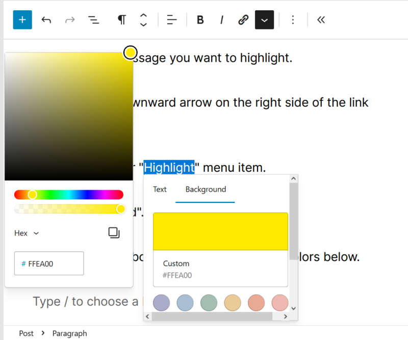
Then you have to aim at the color you wish to use.
I take a shortcut usually and add the color code manually which is super annoying as the it keeps changing all the time when typing.
So I just copy and paste it the HTML color code.
For bright yellow like from a classic text-marker it’s #FFFF00.
You can use a background also adding the background-color property in the CSS. It also works to create a text marker effect.
That way you can “Edit as HTML” and add the following code around the text you want to get highlighted:
<span style="background-color: yellow;"></span>To get there you have to click the three vertical dots in the Gutenberg menu and select the second option from the bottom:
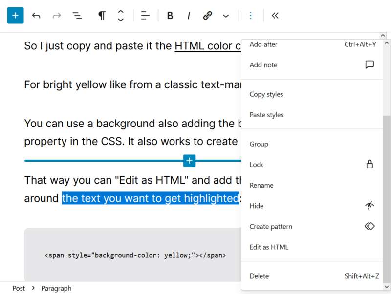
Phew. I always need several attempts, one way or the other.
I have to scroll down to the bottom and then look out in order not to hit delete accidentally.
Luckily you can simply use bold text on the Web
Yet use it wisely and sparingly. Don’t overdo it!
Some people use bold text all over the place so that whole sentences are bolded.
They even advise others to do so. That’s too much though.
Bold is for one or two word terms not more.
Use bold for the most important keyword in your text or paragraph. Do not bold more than one term per paragraph ideally.
Too small or too large font size
Many sites, especially older ones use too small font sizes. It’s like the proverbial “fine print” nobody is meant to read.
Especially during the Flash era many fonts were tiny.
Even though most sites use CSS today the font sizes are too small for many fonts.
With newer fonts and computers that use so called anti-aliasing by default small font sizes that were readable once are not anymore.
Anti-aliasing is simply put font-smoothing.
It looks better for the web designer but it’s difficult to read unlike the clumsy but crisp Web-safe fonts of earlier days.
In case you use a smooth font you have to use even bigger font sizes.
12 – 14px was common sense for normal text until webfonts went mainstream.
Now 14 – 20px is perfectly average for body text. Below 14px most webfonts are unreadable.
Some people use huge headlines as a design element.
Again it looks good but too big type is also difficult to read.
You can’t see the whole word or sentence with one look. You have to move your eyes over the text to read the whole headline.
The wrong fonts, or too many fonts lumped together
UX designers prefer font replacement with web fonts for headlines.
They use larger text these days to make websites look more attractive.
Even body text works with modern fonts like Inter I use here on seo2.blog as well.
I like web fonts as well but sometimes they overdo it.
Also many fonts are simply not meant for longer text so they turn unreadable too.
Also mixing serif and sans-serif fonts is used frequently as a styling technique. This is very distracting.
To improve user experience you have to limit yourself to two or at most three fonts at the same time.
Also all three should be either serif or sans-serif.
Yet don’t use use all there at once unless you want to stress the difference by using both at the same time.
Studies have shown that generally sans-serif fonts are better to distinguish and thus readable than serif fonts on the Web.
In print you might argue it’s the other way around but we are dealing with readability on the Web.
On the Web we only have a few fonts available on all systems, Helvetica and Arial still being the best of those.
Other than that you have to rely on above mentioned web fonts. Selecting readable ones is quite tricky though.
Again, Inter I use here is among the best free ones.
Lack of white space
Good design uses lots of so called white space. White space is the empty room on your page that allows your eyes to rest.
It doesn’t have to be white but white is better than black for example.
In the early days of the Web everybody wanted to build “portals”.
To this day many misguided webmasters claim their site is a portal to sound better.
Today we know better, the less clutter and items to choose from the better the user experience and the more conversions.
White space is a crucial aspect when designing websites.
Ideally you remove all unnecessary design elements and replace them with white space.
Modern sites display almost solely the content.
Design is not about appearance. It’s about content.
Too much or not enough contrast
Sites using black or otherwise dark backgrounds and white type are very straining for the eyes.
I don’t read those at all in many cases.
Other people will try but their eyes will get tired even faster than on other sites.
There is simply too much contrast.
There are sites out there that use different shades of grey for the background color and the written content.
That’s also not recommendable. There is not enough contrast.
Additionally some color combinations are also too bright to look at.
Complimentary colors like red and green can be used as an design element.
High contrast combinations green backgrounds and red type will probably ostracize your readers.
Luckily most sites that combined these are long gone.
You are not sure how readable your text is?
Use simply black type on white backgrounds.
We do not have many black books with white content for a reason.
Do not try to reinvent the wheel when not necessary.
Key takeaways on content design
Content design is much more important than you have thought, isn’t it?
You are still not sure how to implement your newfound knowledge?
Here are the actionable insights:
- Do not use lorem ipsum dummy text, use real content and get it designed from the start
- Use short paragraphs, lists and citations (consider mobile display!)
- Bold the most important keywords and use “text marker” effects on others
- Use font sizes that are both small and big enough to read
- Do not mix several fonts, use standard sans-serif fonts like Helvetica or Arial or web fonts like Inter
- Remove clutter and redundant elements, add white space instead
- Be aware of the contrast onpage and use black type on white background when in doubt
This article does of course not deal with all readability issues or best practices.
These are just a few of the most common ones.
There are other resources I’d recommend to read more on that subject:
- Design for Readability
- What is content design?
- Why Testing with Real Content Is Better Than Lorem Ipsum
- Readability and SEO
- First 2 Words: A Signal for the Scanning Eye
- How Sans-Serif Typeface Styles Affect Readability
* (CC BY 2.0) Creative Commons image by Markus Spiske, raumrot.com