 *
*
Back in 2008 I celebrated my first World Usability Day. How?
By pointing out usability mistakes usability experts commit.
I simply reviewed their website!
In 2010 they still failed. Finally by 2015 they improved their user experience (UX).
So by now I just support their activism.
Yet there is still room for improvement!
There are still some UX mistakes to fix!
Let’s review the site made for World Usability Day 2026 again.
What is World Usability Day and why do I support it?
Let’s take a step back first though and explain what World Usability Day is.
It’s a global day of action with decentralized events taking place all over the globe:
World Usability Day is single day of events occurring around the world
It aims to spread the word and empower people around the world to simplify products and services of all kinds.
It also focuses on accessibility, so that everybody can use them in the first place.
It’s about “making life easier” as their slogan succinctly summarized the goal.
Do they succeed with that mission based on their website?
Here is a completely subjective take on it from a website optimizer with over 25+ years of experience.
Scroll down to read it.
Why do I support them?
Both online and offline products and services should be available and usable by everybody.
That’s true democracy!
Is the World Usability Day website usable?
Is the World Usability Day website usable itself? I tested it.
Yes, by 2026 the website is pretty good on the first sight.
Yet when we look closely there are still issues I’d like to point out so that they can further improve.
Here they are in no particular order.
Wall of text on homepage
In the mobile first era most people read website content on small screens.
Yet even on computers lots of text without proper formatting can he hard to read.
Thus I was surprised to find a wall of text up on top of the site right on the homepage itself:
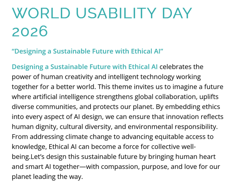
As you see there is no white space whatsoever, no line breaks or even a space after “well being.Let’s”.
It’s very hard to read for me as I experience cognitive issues so I can’t read a lot of text at once.
This is one of the reasons why use plenty of space here on this blog.
Fine print in the logo
Another obvious readability issue is the tiny fine print in the logo.
I had to resize it on Firefox to 170% (even though my Windows is already on +150%) to be able to read the fine print part:

By then (starting at 140%) the enlarged fine print overlapped with the menu and was thus hidden behind it!
So ironically “making life easy” is hard to read.
Vertical website carousel
When you scroll down the page you see a website carousel.
Website carousels are usually requested by C-level executives.
Everybody else knows that they are annoying and hard to use.
This is supported by years of user testing and common knowledge for UX designers.
The carousel here is also exceptional in that it moves automatically up and down on your behalf.
So it’s even more confusing that regular carousels that usually from from side to side (left to right).
Why use a vertical website carousel? I have no idea!
At least don’t make it move automatically please.
CTA buttons are not working properly
The call to action (CTA) buttons on the website do not work as expected.
When I click the first button on top left: “upcoming events” the site just scroll down.
There another button asks to “click me”.
Yet when I click that button the site just jumps back to the top.
So where are the events?
When you click the “Events” menu item you may find them. I had a hard time on that page though.
Why? It only shows a map but no events list. I have to select some options to viewed events first it seems.
When I scroll down I see what appear to be an event, but just one.
The only thing it says is MASS ART UX FAIR all in upper case then UX FAir partly in uppercase.
I almost overlooked the “host city” hidden below on the left.
When you scroll down manually on the hp you will just see past events.
Why hide the actual events for this year?
Social media buttons above logo
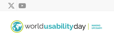
The very first thing you see on top left of the site are the social media buttons (X and YouTube).
I misclicked once in a hurry.
Not sure why they show them on top even above the logo.
Are the third party site more important than their own site?
Looks that way.
I haven’t seen such a prominent use of social buttons anywhere.
Usually they are on top right if they are on top at all.
No or several points of focus
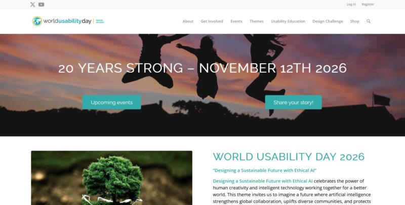
Another issue of Worldusabilityday.org is that the site has no single point of focus.
There are so many similar sized objects on that site vying for attention that I simply had to give up. I picked a random one.
My eyes were jumping like ping pong balls on a table when viewing the site.
The symbolic hero image competes for attention with an image of a manipulated tree on the left and the wall of text on the right.
The hero image partly hides the actual content below the fold.
Why do I review the Worldusabilityday.org website?
You may be annoyed with me now. WTF am I?
Who I am to criticize the usability experts of the world?
I just am. Just someone trying to help.
Yes I’m also sometimes playing various roles on the Web:
- SEO
- blogger
- former web developer.
Yet I’m not an expert on Usability/UX myself I guess. Thus I can look at sites with fresh eyes!
Yes. I’m not a designer.
Still I see so many utterly obvious usability mistakes even without professional training.
Therefore I ask you: What is the purpose of the World Usability Day?
Help me finding out more about World Usability Day!
I’m already confused due to all the issues above and bouncing.
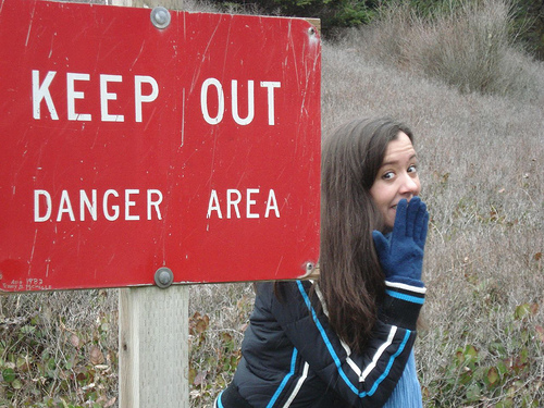
As of now the site still says “keep out” to some unsuspecting visitors!
I hope this review helps to optimize it before Word Usability Day arrives in November!
* Creative Commons image by clpo13