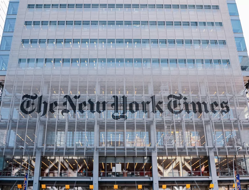
The New York Times is probably the most renowned newspaper globally.
The NYT exists since 1851 and publishes daily ever since.
Even on the Web the leading news source thrives reaching a global audience.
In the US only the Washington Post and The Chicago Tribune have a comparable credibility.
The Boston Globe and The San Francisco Chronicle are also somewhat respected.
That’s about it though.
Thus as a publisher you probably want to be like The NYT.
The same applies to blogging IMHO!
Here’s why and how to blog more like The New York Times than other publications.
Do you read tabloids?
What kind of newspapers do you read offline?
Are you rather the New York Times or the New York Post type?
To make the comparison more obvious:
Are you rather a The Independent or The Sun type?
I don’t mean to suggest you’re from the UK!
Thanks to blogging tools like WordPress everybody can publish a New York Times.
Sure. It will be less important than the original and have a smaller scope.
Yet it will be your own personal newspaper without the paper, a journal or blog indeed.
Are your readers confused?
How do the newspaper and the tabloid compare?
What is the most striking difference between those two?
Is it the content?
No, what comes to your attention first is the interface or simply put “the looks”.
The New York Times articles have plenty of room for your eyes to rest and almost no colors.
The article page is not cluttered and nothing annoys you.
Some of you probably guess it, it’s about usability.
SEO 2 is all about user experience.
Why? Readers are confused because of overloaded interfaces.
They do not find what they seek and hit the “back” button.
That’s called a bounce in website analytics.
Users who are annoyed by your site do not come back.
The colors of success
Users who are tired after sitting all day at the office desk and working on screen do not read your site when its colors hurt their strained eyes.
When all those users do not click or return what do you think happens with your traffic? It drops. Significantly.
So how do you ensure that you get read like the NYT, for centuries?
- Take care of your site UX, use a black and white theme.
- Do not stuff your pages with thousands of widgets and buttons.
- Leave plenty of white space for the eyes to rest.
- Make the fonts readable, not too big, not to small, both are hard to read.
- Do not use animation, especially for banner ads, use static ones.
Your readers will stay and return frequently.
In fact you are going to be The New York Times of your niche with your blog or site.
Want proof? This blogs has been minimalist from day one. And it is still here almost 20 years later.
It was founded back in summer of 2007.